
‘Where there's a will’
BY MARCUS WALTERS
Marcus is an illustrator and co-founder of creative agency New Future Graphic. Marcus’ work spans a wide variety of media and techniques, often incorporating hand crafted elements such as collage and drawing.
“The idea of an eco font is an interesting concept, especially when you consider that it was made by a stationers, and it's free! As a consumer the prospect of saving money on printer ink is appealing, but as a designer I was scrutinising whether it was practical and aesthetically pleasing – you have to want to use it. I have a nostalgic view of stationers. As a student it was a place for me to get the raw materials from which a project was born; Letraset, paper or pens. This project was an excuse to reconnect with a stationer in a digital age where most of a designer's tools exist on the computer.”
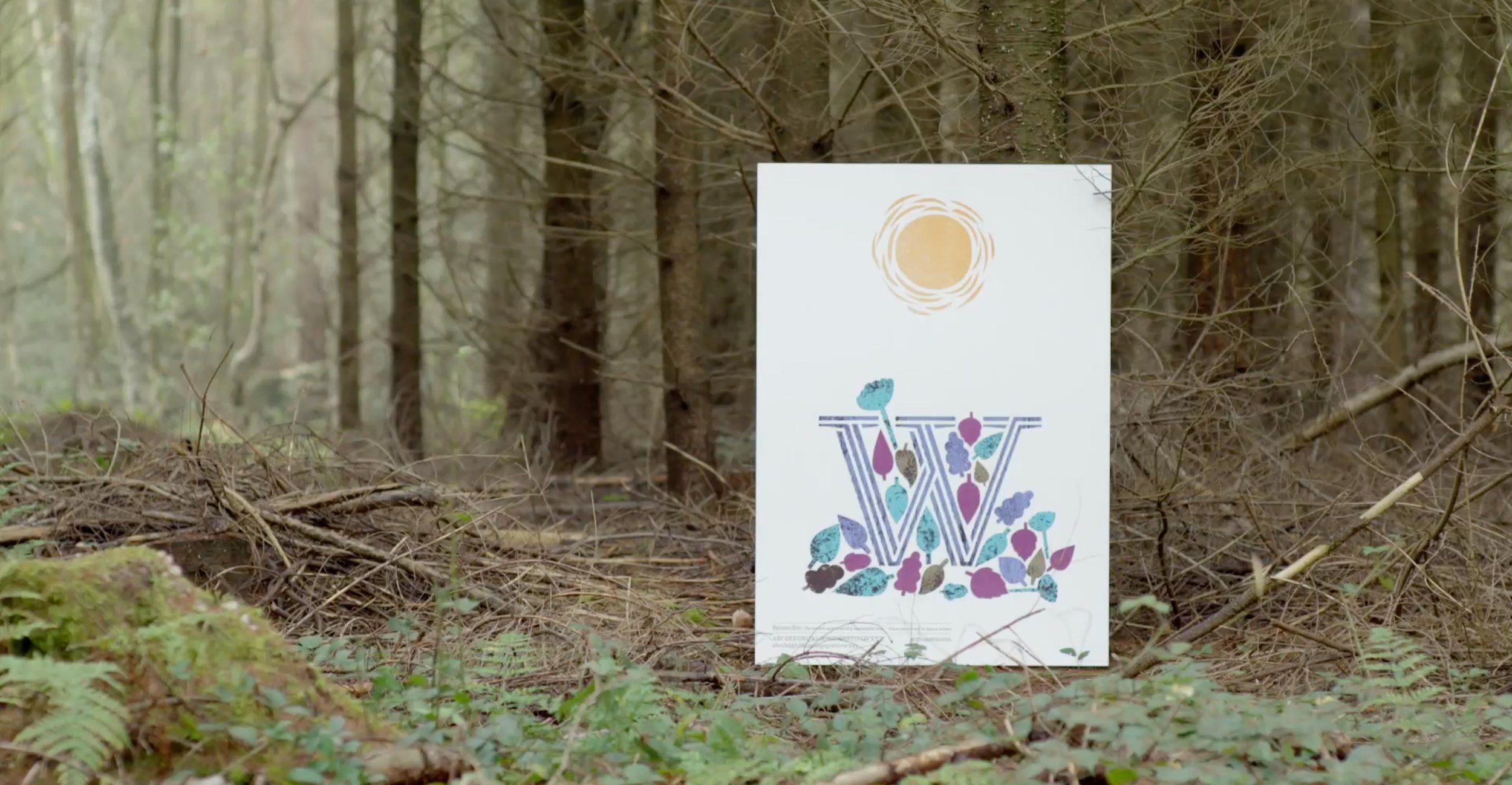
“As an illustrator and designer I belong to the “less is more” school of thought. On first glance my illustration has an intended visual connection with the environment, but each aspect of the image needed to be considered. At the time of working on this poster I was also illustrating a phonetic alphabet, so I was instinctively looking at letters and connecting them to words. When analysing the typeface and its use of positive and negative space I was reminded of wood carving, so it seemed apt to create a narrative around the word 'wood'.”
“I use a lot of hand cut elements in my work which felt natural for use with the the poster. The inky texture of the image relates to this as a printer font, and I loved the idea of the font bleeding to become solid when printed at body copy size. In terms of the colour pallet I wanted to give it an autumnal feel – after all, W is towards the end of the alphabet.”